U.S. Housing Affordability
Where Can Americans Still Afford to Buy a Home?
This project explores how housing affordability has changed across the United States. Using home values and household income, we examine how affordability has shifted over time, how states compare with one another, and which metropolitan areas remain within reach for their residents.
Affordable Regions:
Median Housing Costs
Median Income
<
0.3
01
Home prices are pulling away from household incomes
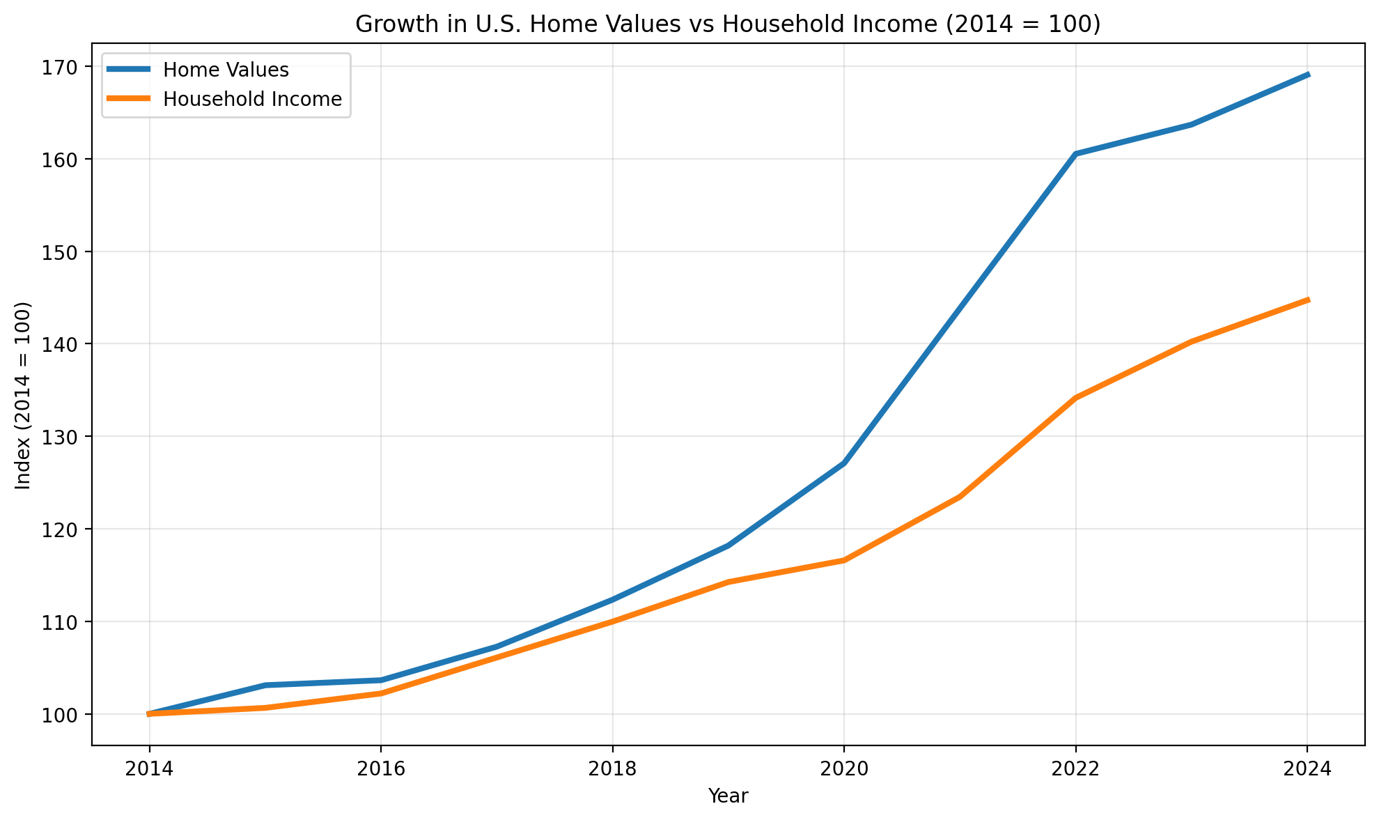
A household's ability to purchase a home depends not only on housing prices, but also on whether income grows quickly enough to keep pace. In recent years, home values have risen much faster than household incomes, widening the gap between what homes cost and what families can afford.
The chart indexes both measures to their 2014 levels, allowing their rates of growth to be compared directly.
02
Watch affordability change across the country
The home-price-to-income ratio measures how many years of a county’s typical household income would equal its typical home value. A higher ratio means that housing is more expensive relative to local earnings.
Drag the year slider or press play to move through time. Hover over a county to view its home value, household income, and price-to-income ratio.
03
How does your state compare?
Geographic maps give larger states more visual space, which can make state-to-state comparison difficult. This tessellated map gives each state equal space, making differences in affordability easier to see.
Find your state and compare its affordability ratio with the rest of the country. Hover over any tile to view its underlying value.
Explore your local market
National trends tell only part of the story
Affordability can vary substantially within the same state. The following views move from national and state patterns into individual metropolitan markets and the forces shaping them.
State comparison
Your metro versus the rest of your state
You're not just choosing where to live—you're choosing where to live within your state. Housing costs can vary dramatically between metropolitan areas. This visualization helps you see whether your metro is among the most or least affordable places in your state and how it compares with neighboring markets.
Click a state on the map to display its metropolitan areas. Hold Shift while clicking to select more than one state. Enter your net income to update which metros appear affordable for your household.
Explore local markets
Compare affordability across metropolitan areas
Housing markets can move very differently even within the same state. This view tracks four measures that help describe both affordability and market activity for a selected metropolitan area.
Choose a state and metro area in the sidebar. Hover over any bar to view the value and year-over-year change.
Increase from prior year
Decrease from prior year
Four views of the local housing market
Median home price shows what homes cost, while income needed to buy and mortgage share of income place those costs in the context of household finances. Annual sales count provides a view of market activity and demand.
Income needed to buy
Mortgage share of income
Annual sales count
Drivers of affordability
The Broader Context
Affordability is connected to a wider housing-market system. Many factors can affect housing prices (Migration, monthly payments, etc.), and the relationship between each factor and affordability is not constant.
Indexed trends & rolling correlation
The top panel shows changes in each variable indexed to the selected year (in units of each factor's own historical range). The bottom panel shows each factor's trailing 24-month correlation with the fraction of income. Above zero they move together, below zero they move oppositely.
Drag the vertical rule to change the selected year, and toggle which factors to show.
Factors to show alongside fraction of income
How unusual was the selected year?
Each bar is the selected year's change measured in standard deviations (σ) from that factor's typical yearly change. The grey band behind each bar is the factor's full historical range.